Building JavaScript Real Time Charts and Graphs: A Step-by-Step Tutorial


")


Create dynamic and engaging data visualizations with JavaScript Real Time Charts and Graphs. Follow this step-by-step tutorial to learn how to build them from scratch and create stunning visualizations with ease.
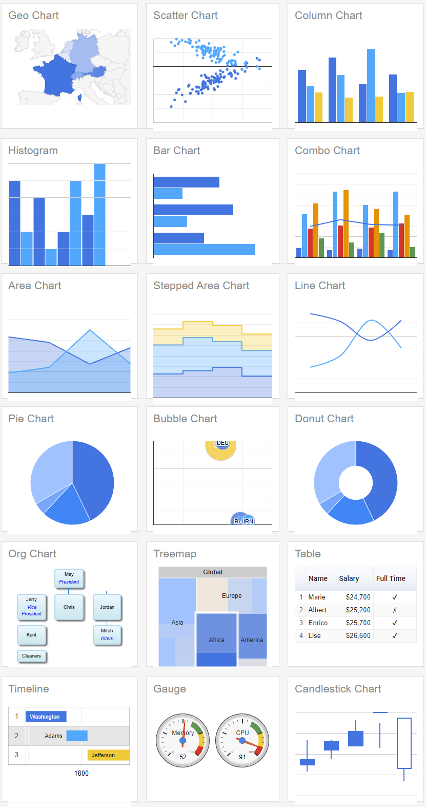
Such JavaScript Real Time, Dynamic or Live Charts are often used in dashboards to display developments of e.g. temperatures or prices. There are numerous possible uses for these JavaScript charts. We will reproduce the following view in this tutorial:
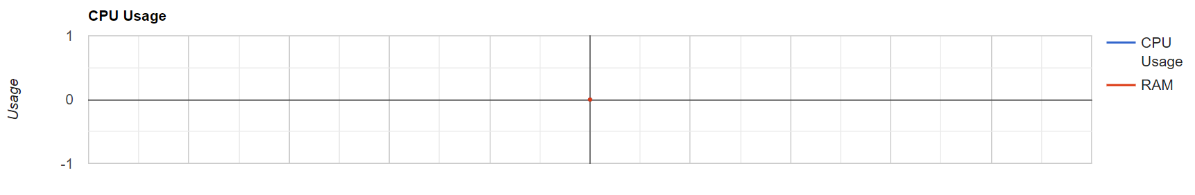
I will show you here how to create this Real Time JavaScript Graph. It updates every 100 milliseconds and displays random data. In productive use, it can read and display data from a database or directly from a sensor.
But that’s not all. The same code can be applied to many other diagram types with minimal adjustments. Only minor adjustments are necessary. Here is a list of possible diagrams:
Google Chart API – Short introduction
The Google Chart API is a free service from Google that allows us to display various graphs, charts and diagrams in our website or web application.
In addition, the graphs offer interactive functions for the user. For example, a pop-up with the values of the current element can be displayed when hovering.
The data is displayed statically. But we develop our own system around it, so that we can update the data in a certain interval, and thus get our real time chart. The data is then (quasi) updated live in real time and the desired effect is created.
1. Include Google Chart API
The Google Chart API must be included via this script tag. Local hosting is not possible here, as Google’s Terms of Service prohibit it. Simply insert the script tag before the closing body tag.
<script type="text/javascript" src="https://www.gstatic.com/charts/loader.js"></script>
2. Create HTML container
Next, we need a simple div where the Google API will later draw the chart as SVG or VML.
<div id="chart_div"></div>
3. Initialize and configure Google Chart API
In the following code, we load the line chart package from the Google Chart Packages. We then call the drawChart() function as a callback. This will be executed once the API is fully loaded.
// load current chart package
google.charts.load("current", {
  packages: ["corechart", "line"]
});

// set callback function when api loaded
google.charts.setOnLoadCallback(drawChart);
Next we create an object with label (will not be displayed) and default data for the chart. We also need an array with options. Here we set the title and the axes label.
All parameters can be found in detail in the Google Chart documentation.
After that we select our HTML container and let chart.draw(data, options) draw the chart.
function drawChart() {

  // create data object with default value
  let data = google.visualization.arrayToDataTable([
    ['Time', 'CPU Usage', 'RAM'],
    [0, 0, 0],
  ]);

  // create options object with titles, colors, etc.
  let options = {
    title: "CPU Usage",
    hAxis: {
      textPosition: 'none',
    },
    vAxis: {
      title: "Usage"
    }
  };

  // draw chart on load
  let chart = new google.visualization.LineChart(
    document.getElementById("chart_div")
  );
  chart.draw(data, options);
}
With the previous code, the table is now already drawn and we can become a first look at it.
4. Update data in real time (live)
Now we come to the most important part of why you are here in the first place – the dynamic live updating of the data in real time. This is how we “create” our real time chart. We add new data to the chart in an interval of 100ms (10x per second).
The variable index is used to insert another element as a row and has no further meaning. The variable maxDatas specifies the maximum number of data rows that are displayed. This creates the effect that always only the 50 newest data records are displayed.
In this example I generate random numbers which should be understood as CPU Usage and RAM Usage. Here you have to insert your own data in line 8 and 9. You can do this for example with an Ajax request. So you can read data directly from your database using PHP and a database class or you write your own RestAPI, e.g. with Node.js.
// max amount of data rows that should be displayed
let maxDatas = 50;

// interval for adding new data every 250ms
let index = 0;
setInterval(function () {
  // instead of this random, you can make an ajax call for the current cpu usage or what ever data you want to display
  let randomCPU = Math.random() * 20;
  let randomRAM = Math.random() * 50 + 20;

  if (data.getNumberOfRows() > maxDatas) {
    data.removeRows(0, data.getNumberOfRows() - maxDatas);
  }

  data.addRow([index, randomCPU, randomRAM]);
  chart.draw(data, options);

  index++;
}, 100);
Here now again the complete code in a file. For clarity I have packed everything in one file. You should put JavaScript and CSS in extra files.
<!DOCTYPE html>
<html lang="en">
  <head>
    <meta charset="UTF-8" />
    <title>Document</title>
    <style>
      #chart_div {
        width: 1200px;
      }

      body {
        display: flex;
        justify-content: center;
        align-items: center;
      }
    </style>
  </head>

  <body>
    <!-- CONTAINER FOR CHART -->
    <div id="chart_div"></div>
    <script
      type="text/javascript"
      src="https://www.gstatic.com/charts/loader.js"
    ></script>
    <script>
      // load current chart package
      google.charts.load('current', {
        packages: ['corechart', 'line'],
      });

      // set callback function when api loaded
      google.charts.setOnLoadCallback(drawChart);

      function drawChart() {
        // create data object with default value
        let data = google.visualization.arrayToDataTable([
          ['Time', 'CPU Usage', 'RAM'],
          [0, 0, 0],
        ]);

        // create options object with titles, colors, etc.
        let options = {
          title: 'CPU Usage',
          hAxis: {
            textPosition: 'none',
          },
          vAxis: {
            title: 'Usage',
          },
        };

        // draw chart on load
        let chart = new google.visualization.LineChart(
          document.getElementById('chart_div')
        );
        chart.draw(data, options);

        // max amount of data rows that should be displayed
        let maxDatas = 50;

        // interval for adding new data every 250ms
        let index = 0;
        setInterval(function () {
          // instead of this random, you can make an ajax call for the current cpu usage or what ever data you want to display
          let randomCPU = Math.random() * 20;
          let randomRAM = Math.random() * 50 + 20;

          if (data.getNumberOfRows() > maxDatas) {
            data.removeRows(0, data.getNumberOfRows() - maxDatas);
          }

          data.addRow([index, randomCPU, randomRAM]);
          chart.draw(data, options);

          index++;
        }, 100);
      }
    </script>
  </body>
</html>
Use other chart types (Donut, Bar, Gauge, …)
As already announced at the beginning, the data can also be transferred to other charts with little effort.
In these examples, the respective red-marked lines must be adjusted.
Gauge Chart
// load current chart package
google.charts.load('current', {
  packages: ['corechart', 'gauge'],
});

// set callback function when api loaded
google.charts.setOnLoadCallback(drawChart);

function drawChart() {
  // create data object with default value
  let data = google.visualization.arrayToDataTable([
    ['CPU Usage', 'RAM'],
    [35, 50],
  ]);

  // create options object with titles, colors, etc.
  let options = {
    title: 'CPU Usage',
    hAxis: {
      textPosition: 'none',
    },
    vAxis: {
      title: 'Usage',
    },
    redFrom: 90,
    redTo: 100,
    yellowFrom: 75,
    yellowTo: 90,
    minorTicks: 5,
  };

  // draw chart on load
  let chart = new google.visualization.Gauge(
    document.getElementById('chart_div')
  );
  chart.draw(data, options);

  // max amount of data rows that should be displayed
  let maxDatas = 50;

  // interval for adding new data every 250ms
  let index = 0;
  setInterval(function () {
    // instead of this random, you can make an ajax call for the current cpu usage or what ever data you want to display
    let randomCPU = Math.random() * 20 + 20;
    let randomRAM = Math.random() * 50 + 40;

    if (data.getNumberOfRows() > maxDatas) {
      data.removeRows(0, data.getNumberOfRows() - maxDatas);
    }

    data.setValue(0, 0, randomCPU);
    data.setValue(0, 1, randomRAM);
    chart.draw(data, options);

    index++;
  }, 1000);
}
Bar Chart
// load current chart package
google.charts.load('current', {
  packages: ['corechart', 'line'],
});

// set callback function when api loaded
google.charts.setOnLoadCallback(drawChart);

function drawChart() {
  // create data object with default value
  let data = google.visualization.arrayToDataTable([
    ['Unit', 'Value', { role: 'style' }],
    ['CPU Usage', 1, 'gold'],
    ['RAM', 1, 'silver'],
  ]);

  // create options object with titles, colors, etc.
  let options = {
    title: 'CPU Usage',
    hAxis: {
      textPosition: 'none',
    },
    vAxis: {
      title: 'Usage',
    },
  };

  // draw chart on load
  let chart = new google.visualization.BarChart(
    document.getElementById('chart_div')
  );
  chart.draw(data, options);

  // max amount of data rows that should be displayed
  let maxDatas = 50;

  // interval for adding new data every 250ms
  let index = 0;
  setInterval(function () {
    // instead of this random, you can make an ajax call for the current cpu usage or what ever data you want to display
    let randomCPU = Math.random();
    let randomRAM = Math.random() * 10;

    if (data.getNumberOfRows() > maxDatas) {
      data.removeRows(0, data.getNumberOfRows() - maxDatas);
    }

    data.setValue(1, 1, randomCPU);
    data.setValue(1, 1, randomRAM);
    chart.draw(data, options);

    index++;
  }, 1000);
}
Pie/Donut Chart
// load current chart package
google.charts.load('current', {
  packages: ['corechart', 'line'],
});

// set callback function when api loaded
google.charts.setOnLoadCallback(drawChart);

function drawChart() {
  // create data object with default value
  let data = google.visualization.arrayToDataTable([
    ['Unit', 'Value'],
    ['CPU Usage', 1],
    ['RAM', 1],
  ]);

  // create options object with titles, colors, etc.
  let options = {
    title: 'CPU Usage',
    hAxis: {
      textPosition: 'none',
    },
    vAxis: {
      title: 'Usage',
    },
  };

  // draw chart on load
  let chart = new google.visualization.PieChart(
    document.getElementById('chart_div')
  );
  chart.draw(data, options);

  // max amount of data rows that should be displayed
  let maxDatas = 50;

  // interval for adding new data every 250ms
  let index = 0;
  setInterval(function () {
    // instead of this random, you can make an ajax call for the current cpu usage or what ever data you want to display
    let randomCPU = Math.random();
    let randomRAM = Math.random();

    if (data.getNumberOfRows() > maxDatas) {
      data.removeRows(0, data.getNumberOfRows() - maxDatas);
    }

    data.setValue(1, 1, randomCPU);
    data.setValue(1, 1, randomRAM);
    chart.draw(data, options);

    index++;
  }, 1000);
}
To turn the pie chart into a donut chart, you just have to add the parameter pieHole with the value 0.2 to the options object.
The Google Chart API can do much, much more! You can find a comprehensive documentation here.
Hello everybodyMaybee somebody know how can get data from MySQL (x and y value) every 10 seconds and update chart every 10 seconds.Any help I appreciate
In the above code it was given ‘instead of using random we can display any data using ajax call’, please guide me on how to display lm35 temperature sensor data and get its plot in real time.
Thanks for the suggestion! When I update the post, I will go into it in more detail 🙂
Cool,
How about fixed hAxis (last x records) with current timestamp.
how to add new random data ?
What do you mean exactly? The interval is setting new data in every run…
LH